Update of Bootstrap 5 Versions – Bootstrap is a free open-source CSS framework for front-end development. It is one of the most popular development tools in the web designer community.
All are waiting for the new version of bootstrap. When bootstrap 5 is released.
The fundamental concept of bootstrap, grid layout, responsive content of HTML-CSS-based components will probably have no change.
Nevertheless, some of the things possibly change such as jQuery and the library.
This time bootstrap 5 releases in a different version.
- Bootstrap 5 Alpha version was released on June 16, 2020.
- Bootstrap 5 Alpha 2 version was released on September 29, 2020.
- A Bootstrap 5 Alpha 3 version was released on November 11, 2020.
- Bootstrap 5 Beta version released on December 7, 2020.
- Bootstrap 5 Beta 2 version was released on February 10, 2021.
- A Bootstrap 5 Beta 3 version was released on March 22, 2021.
Now, let’s find out the Update of Bootstrap 5 Versions:
Bootstrap 5 Alpha version
This is the first version of Bootstrap5. So, we expect more changes.
Bootstrap no longer depends on jQuery and we’ve dropped support for Internet Explorer.
A highlight of the Alpha version:
New look and feel
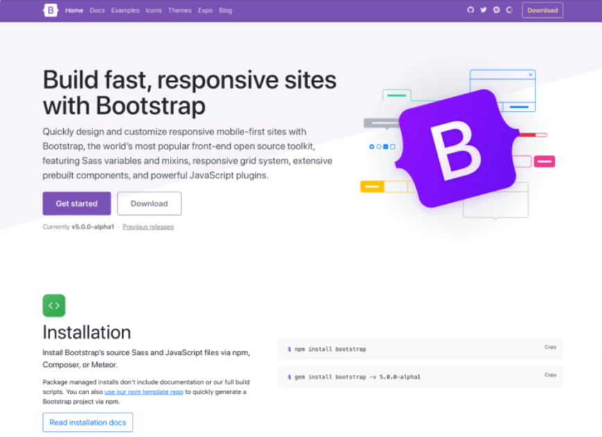
In bootstrap5 we introduce a brand-new logo of bootstrap. but suffice to say we wanted to give the ol’ B in a rounded square a small upgrade.
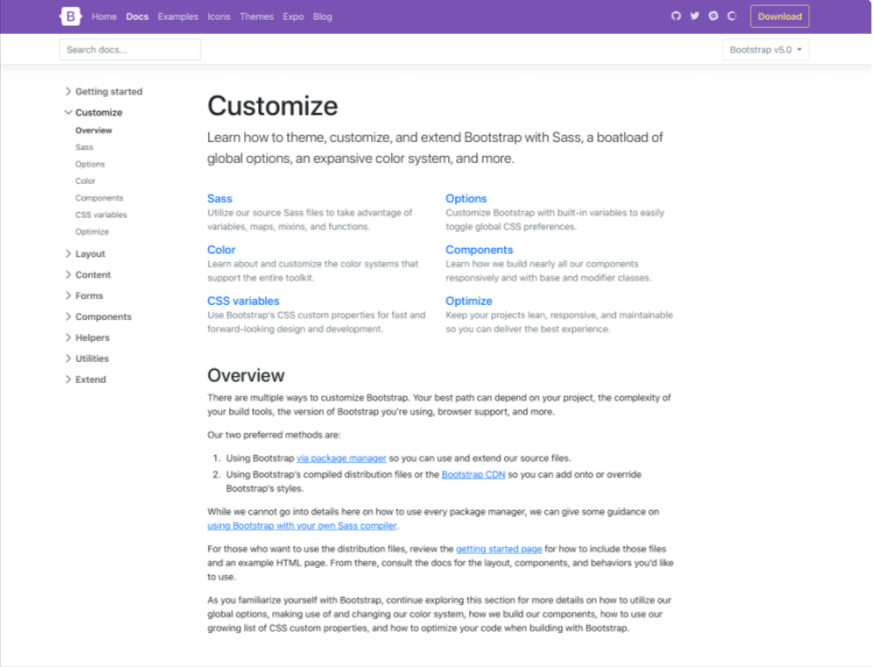
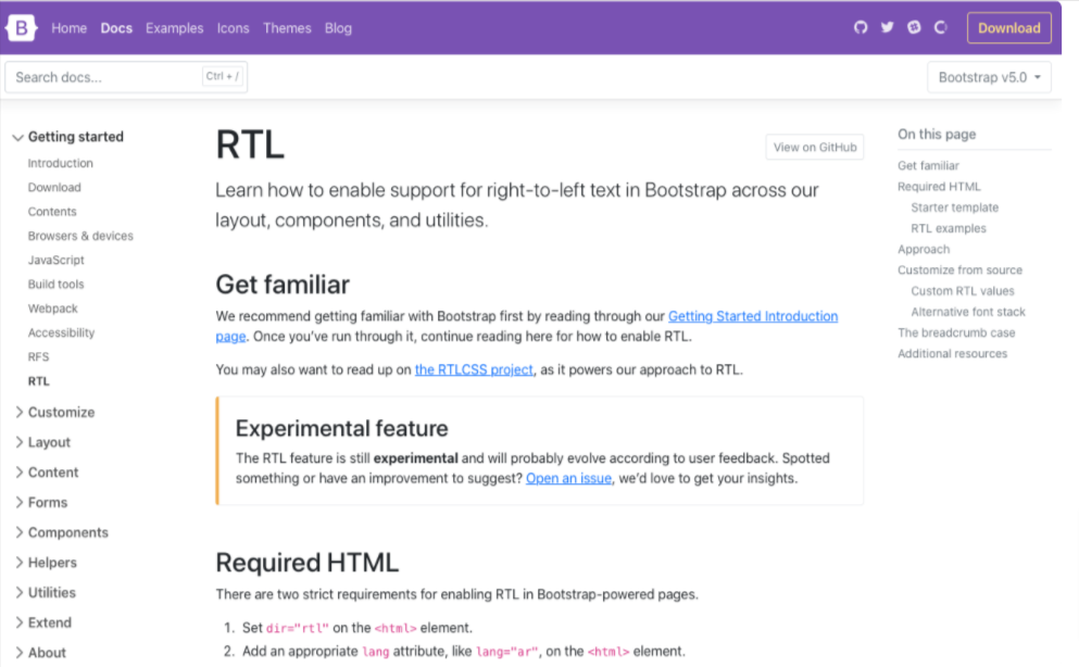
The docs page now no more full width to improve readability and the device support looks like an app. In advance, we upgrade the sidebar section to expandable. – Update of Bootstrap 5 Versions
jQuery and JavaScript
jQuery is a fast, small, and feature-rich js library. It makes things like HTML document traversal and manipulation even handling animation of ajax much similar to an easy-to-use API that works across a multitude of browsers.
Thanks to advancement made in front-end development tools and browser support, we’re now able to drop jQuery as a dependency
CSS custom property
In bootstrap 5 using CSS custom properties in Bootstrap 5 thanks to dropping support for Internet Explorer. In v4 we only included a handful of root variables for color and fonts, and now we’ve added them for a handful of components and layout options.
Improve customizing docs
In Bootstrap V5 documentation improved; giving more explanation, removing ambiguity, and providing much more support for extending Bootstrap. It Includes a whole new Customize section. – Update of Bootstrap 5 Versions
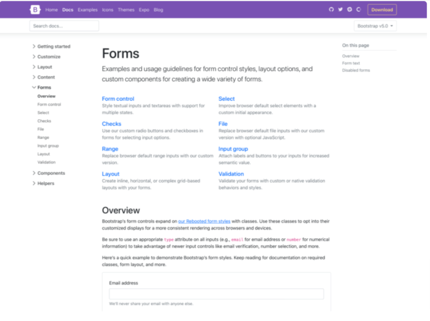
Updated forms
In addition to the new Customize section, we’ve overhauled our Forms documentation and components. We’ve consolidated all our form styles into a new Forms section (including the input group component) to give them the emphasis they deserve.
Utilities API
We are curious that how to build new and interesting CSS libraries and toolkits, it’s challenging to build on the web for the last decade. We have a brand-new utility API in bootstrap5.
$utilities: () !default;
$utilities: map-merge(
  (
    // ...
    "width": (
      property: width,
      class: w,
      values: (
        25: 25%,
        50: 50%,
        75: 75%,
        100: 100%,
        auto: auto
      )
    ),
    // ...
    "margin": (
      responsive: true,
      property: margin,
      class: m,
      values: map-merge($spacers, (auto: auto))
    ),
    // ...
  ), $utilities);
Enhanced grid system
In bootstrap 5 grid system is completely different. We have modified the existing grid system instead of replacing it with a completely new one.
Here are some of the major changes in the Grid system.
- Added a new grid tier.
- .gutter classes have been replaced with .g* utilities, much like our margin/padding utilities. It also added options to your grid gutter spacing that matches the spacing utilities you’re already familiar with.
- Form layout options have been replaced with the new grid system.
- Vertical spacing classes have been added.
- Columns are no longer position: relative by default. – Update of Bootstrap 5 Versions
Here’s a quick example of how to use the new grid gutter classes:
<div class="row g-5">
  <div class="col">...</div>
  <div class="col">...</div>
  <div class="col">...</div>
</div>
Bootstrap 5 Alpha 2 version
The alpha version comes with a new update:
Updated docs nav
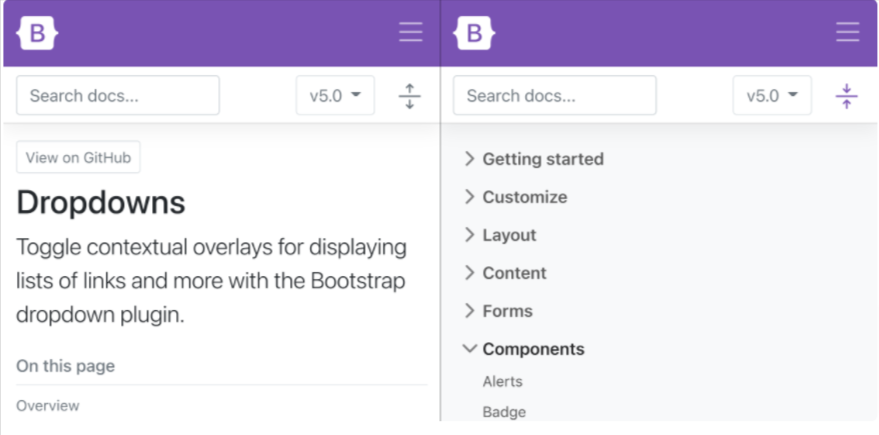
Navigation in docs to make things easier to use. In new version redesigned the main navbar to hide links on small devices, and when expanded, those navigation links now have larger tap targets.
A new version redesigned the main navbar to hide links on small devices, and when expanded, those navigation links now have larger tap targets.
The sub nav has also be streamlined to take up a single horizontal bad on mobile, giving more space for documentation. We’ve also differentiated the expanding and collapsing menu icons between the two nav.
Dark carousel
Add .carousel-dark to any .carousel to switch from the default white text, controls, and indicators to black.
Values are configurable via Sass variables. To save on file size, we’re using a CSS filter to invert out SVGs for the carouse controls.
Dark dropdown
Dark is now on-trend, and bootstrap 5 latest version did not ignore it.
Add .dropdown-menu-dark to any dropdown menu to change the appearance. Dark dropdowns are opt-in, so you’ll need to add the class as you go.
Redesign close button
Our close button has been renamed, redesigned, a new focus state, and a new color option.
Position utilities
A new version includes position elements with a new top, right, bottom, and left utilities with support for 0, 50%, and 100% by default.
Bootstrap 5 Alpha 3 version
Bootstrap 5 Alpha 3 landed with tons of updates to our components, utilities, docs, forms, JavaScript, and more.
Components
Bootstrap 5 improved a handful of components in this release and even dropped one for some new and improved utilities.
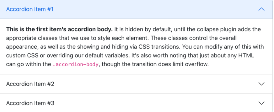
New accordion
In bootstrap 5 Alpha 3 dropped the .card-based accordion for a brand new .accordion component, solving several bugs in the process.
A new accordion still uses the Collapse JavaScript plugin, but with custom HTML and CSS to support it, it’s better and easier than ever to use.
The new accordion includes Bootstrap Icons as chevron icons indicating state and click-ability.
Comes with a new Block button
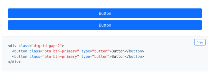
Block buttons are no more in v5—we’ve dropped the .btn-block class for .d-grid and .gap-* utilities. This allows for the same behavior and style, but with much greater control over spacing, alignment, and even responsive layout options.
SaaS changes
There are 3 important changes in the SaaS source file:
- Switched to Dart Sass with LibSass being deprecated.
- The color system which worked with color-level() and $theme-color-interval was removed in favor of a new color system. All lighten() and darken() functions in our codebase are replaced by tint-color() and shade-color().
- Added a Sass variable for CSS custom property prefixes.
Forms
Forms come with exciting changes such as floating labels as a fully-fledged form layout option and a new file input.
Floating labels include support for textual inputs, selects, and textures. We have one limitation with textareas where multiple lines of text can be obscured by the floating label.
Bootstrap 5 Beta version
The first beta version release with breaking changes. Let’s light up features:
RTL
In the latest version comes with RTL Support. It includes:
- New RTL versions of our CSS dist file, which includes our grid, Reboot, utilities, and standard bundles. See the Contents page for a full list of files.
- New RTL documentation to help you get started.
- Five new RTL Examples that show our new RTL CSS in action, converting our Album, Checkout, Carousel, Blog, and Dashboard examples into all-new right-to-left equivalents.
- Two new cheatsheet kitchen sink pages—the default cheatsheet for our standard CSS and the RTL cheatsheet.
Renamed classes for logical properties
In a beta version have renamed several classes and variables. It’s a risky change because of the size and impact of the change.
Most of you have already interacted with logical properties thanks to our flex utilities—they replace direction properties like left and right in favor of start and end.
Things like align-items-end have been welcomed additions. This makes horizontal directional class names appropriate for LTR and RTL without any additional overhead moving forward.
Popper.js
In a beta version upgraded Popper.js v1 to v2. Popper.js v2 also comes with a smaller file size for our primary dependency, updated positioning calculations, and much more. Beyond that, our tooltips and popovers are unchanged and just as powerful.
JS enhancements
- Created a new base component to share logic across our components.
- Migrate to more modern APIs across our plugins.
- Tooltips and popovers can now have custom classes.
- Don’t hide modal when config. the keyboard is false.
Bootstrap 5 Beta 2 version
In a beta 2 comes with some awesome update:
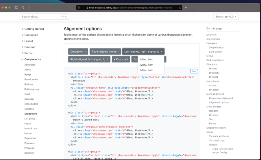
Dropdowns
In beta 2 dropdowns saws a lot of work in Beta 2 because of how much has changed in both our JavaScript and in Popper.js. We’ve modified our dropdown plugin to add a new data attribute to help separate our own positioning styles with that of Popper’s.
The issue is facing such as the .dropstart menu overlapping a button or an incorrect responsive .dropdown-menu-end class—were largely the result of competing positioning.
In beta version we have new dropdowns menus have data-bs-display=”static”, as well as add data-bs-popper=”static” via JavaScript to their associated .dropdown-menu. When dropdowns are in our navbars, their menus will have data-bs-popper=”none” added.
Color utility docs
We added color utility documentation, separating the text color classes from our background-color ones. We’ve also made extensive use of our scss-docs shortcode to include tons more code snippets in docs.
JS Updates
We’ve spent a significant amount of time in Beta 2 improving our JavaScript plugins to fix bugs and improve behaviors since dropping jQuery.
- Dropdown now emits events on the .dropdown-toggle instead of the .dropdown.
- Restored the offset option for dropdowns.
- Fixed modal toggling when clicking on data-bs-toggle=”modal”.
- Build our base component as a separate .js file.
- Prevent getSelector from returning URLs as a selector which caused errors in the dropdown and scrollspy plugins.
- Refactored components to use a utility function to define jQuery plugins
Bootstrap 5 Beta 3 version
The Beta 3 version release with breaking changes. This is a stable version which fixes all previous version changes. Let’s light up features:
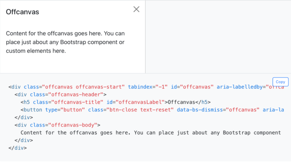
New offcanvas component
This is a new feature developed by the Bootstrap team. Built on and sharing fundamental pieces of our modals, the off-canvas comes with a configurable backdrop, body scroll, and placement.
Offcanvas components can be placed on the left, right, and bottom of the viewport. Configure these options with data attributes or via the JavaScript APIs.
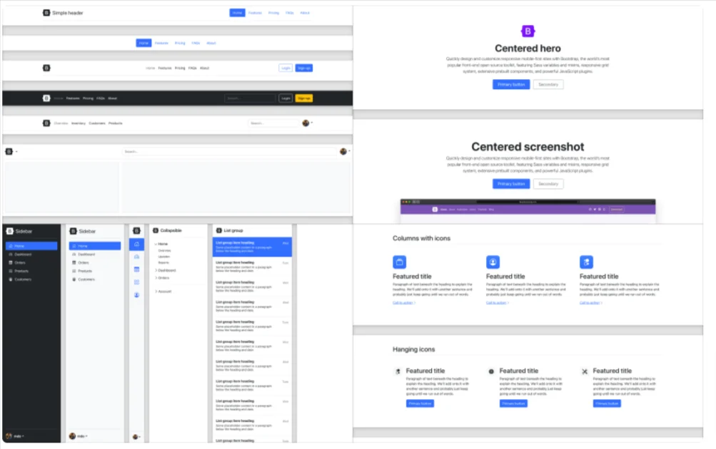
New and refreshed examples
In a new version added four new snippets for headers, heroes, features, and sidebars. These new snippets will continue to grow with new additions over time, showing just how fun and easy it is to build with Bootstrap.
Improved SaaS docs – Update of Bootstrap 5 Versions
Bootstrap beta 3 added a new section to nearly every component and utility documentation page for the source Sass code. Where appropriate, we now list Sass variables, maps, loops, and animation keyframes.
These are directly linked from our source files, so whenever we ship new code, they’ll automatically be up-to-date.
Conclusion – Update of Bootstrap 5 Versions
In conclusion, a new version comes with new updates. We expect a new version that comes with new changes.
Check More Articles –











Comments