We’re excited to release UIAble v1.4.0, bringing another set of open-source components and UI blocks designed to solve common interface patterns without adding unnecessary complexity.

We’re excited to release UIAble v1.4.0, bringing another set of open-source components and UI blocks designed to solve common interface patterns without adding unnecessary complexity.
Over the past week, our focus wasn’t on building something entirely new, it was on making UIAble better. We revisited existing components, added the variants we kept reaching for ourselves, and introduced a few new UI blocks that are ready to drop into your next project.
Here’s everything that’s new in UIAble v1.3.0.
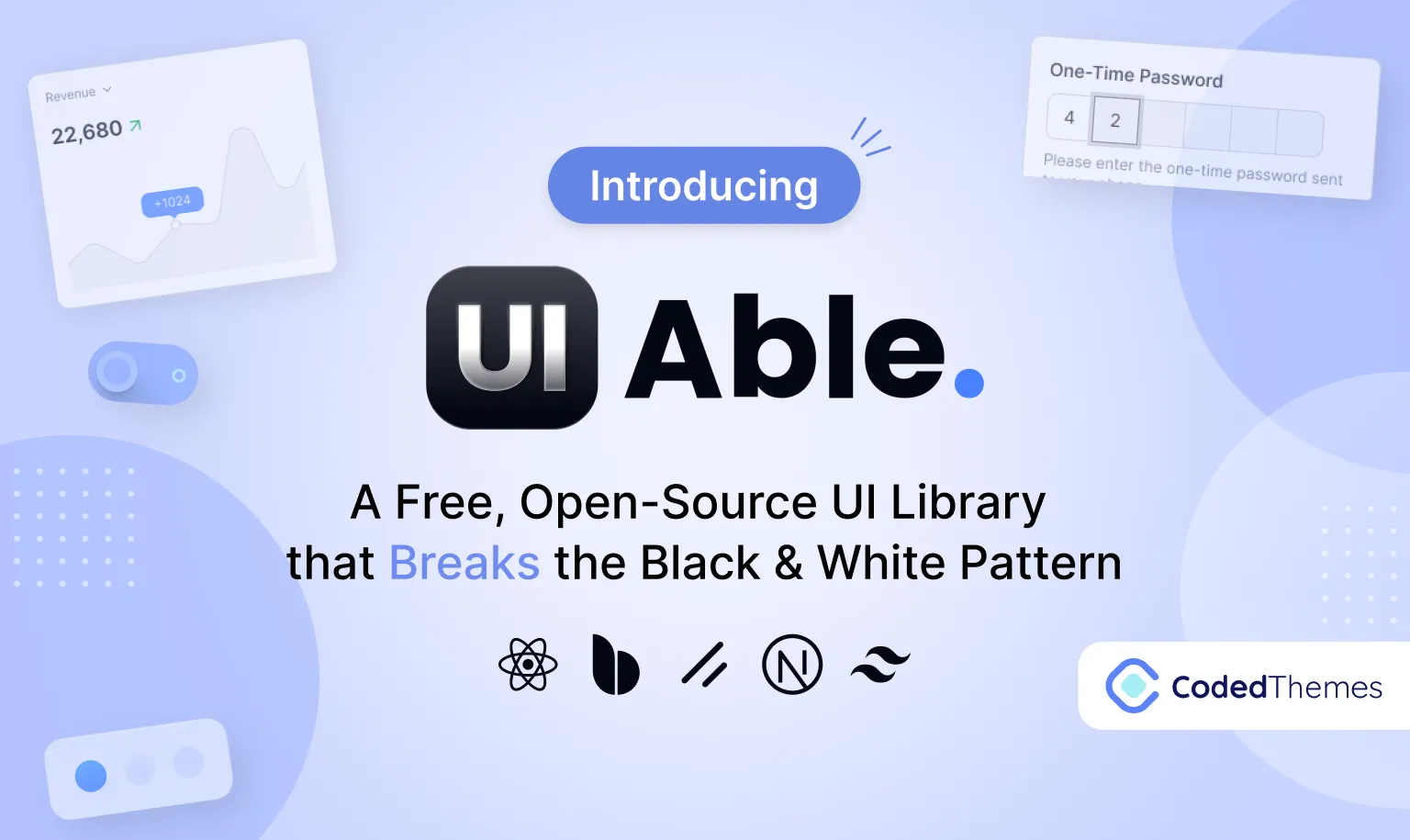
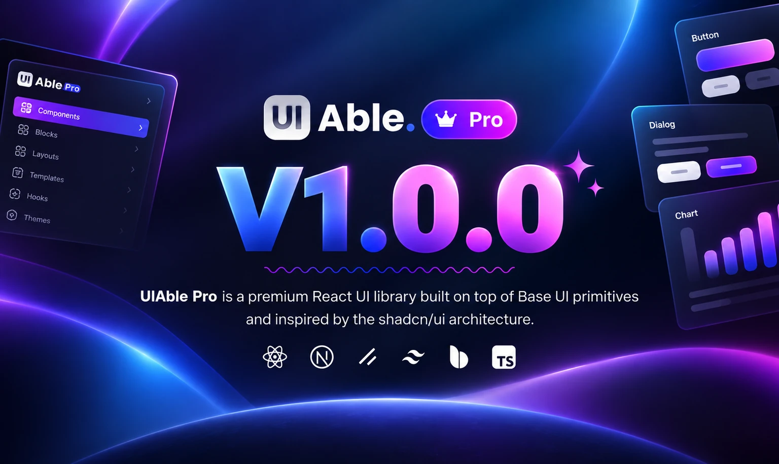
Today, we’re excited to launch UIAble v1.0.0, an open-source component library built for developers, by developers.
We explored a lot of UI libraries built on Shadcn. Most of them feel nearly identical — same structure, same aesthetic, same tradeoffs. That’s what pushed us to build something different. Not another library that looks like Shadcn with a coat of paint, but a design system with its own identity and a clearer sense of what it’s actually for.
Animated UI component libraries are pre-built React component collections where scroll effects, hover animations, mount transitions, and micro-interactions come baked in by default. No more writing Framer Motion configs from scratch on every single project. In 2026, the good ones are shadcn-compatible, Tailwind-based, and ship source code directly into your project so you actually own what you use. This guide breaks down the top ten, puts them in a comparison table, covers how they work under the hood, and gives you a straight answer on which one fits landing pages, dashboards, and lightweight builds.
Building Vue applications usually means working with a UI library. You pick one like PrimeVue, install it, and start building. Everything feels good at first. You get beautiful components out of the box, import them, and move quickly.
Then reality hits. Your client wants the button to behave differently. Your design system needs a sidebar with custom spacing. A component you need simply isn’t there. So you start overriding styles, wrapping components, pulling in a second library because the first one doesn’t cover everything. Before long, the codebase is a mess.
This is the problem shadcn-vue solves.
Creating web projects today is much more complicated. Web developers do not just create pages; they develop entire web apps with dashboard interfaces, advanced forms, live updates, and custom user interfaces.
The choice between Shadcn/ui and Chakra UI depends on how you build your application’s UIs. For example, if you enjoy total control and flexibility while building your interfaces, shadcn/ui can work out for you.
In 2026, the frontend development will be characterized by performance, flexibility, and scalability. Developers do not seek strict UI libraries that require them to stick to existing styles or sizeable component systems. Rather, they like systems that have complete control, composable systems, and clean architecture.
Stay updated on upcoming Premium & Free themes, exclusive promo codes, and special sales!