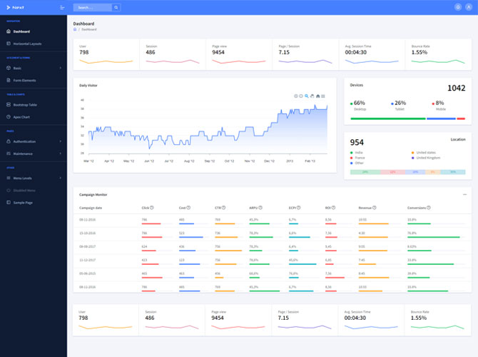
What is Responsive Web Design?
Responsive web design is a method of building and maintaining websites that provide excellent viewing and interaction experiences on a variety of devices and screen sizes. By utilizing media queries, fluid grids, and flexible layouts, responsive design allows the information and layout of a website to adapt to the user’s device in real-time, eliminating the need to create separate versions of the site for different devices.
STEP 1: Start with Wireframes
Wireframing is an important step in the website design process because it helps you sketch out the structure and layout of your site without being distracted by visual design components. Begin by designing wireframes for various screen sizes, concentrating on the most important aspects and functionality of your website.
STEP 2: Decide Breakpoints
The CSS code for your website’s layout changes at specific areas called breakpoints so that it can adapt to different screen sizes. Define breakpoints for popular device sizes and orientations, such as smartphones (portrait and landscape), tablets, and desktops.
CSS Code:
/* Example of defining breakpoints */
@media only screen and (max-width: 600px) {
/* Styles for small screens */
}
@media only screen and (min-width: 601px) and (max-width: 1024px) {
/* Styles for medium screens */
}
@media only screen and (min-width: 1025px) {
/* Styles for large screens */
}
STEP 3: Design for small displays first
A mobile-first approach to design ensures that your website is optimized for small displays and gradually improved for larger ones. Begin by developing and prototyping for mobile devices, emphasizing simplicity, clarity, and usability.
STEP 4: Create a Fluid Grid
A fluid grid system dynamically adapts your website’s layout to multiple screen sizes by using percentages instead of fixed pixel values for widths and margins. Develop a flexible grid system with CSS frameworks such as Bootstrap or develop bespoke grid layouts with CSS Grid or Flexbox.
CSS Code:
/* Example of creating a fluid grid */
.container {
width: 100%;
max-width: 1200px;
margin: 0 auto;
padding: 0 20px;
box-sizing: border-box;
}
.column {
width: 100%;
padding: 0 20px;
box-sizing: border-box;
}
@media only screen and (min-width: 768px) {
.column {
width: 50%;
}
}