

The field of UI design is developing faster today than it ever has before. More tools, cleverer users, and different devices change the nature of how digital products look and feel. As we transition into 2026, a focus on clarity, accessibility, and the person using those experiences instead of the reverse is coming into view.
Before we dive into the UI design trends, here are a few numbers from recent studies that show where the industry is heading.
- A study conducted in the industry in 2025 found that during the early design phases of ideation and wireframing, 70% of designers now use AI tools.
- Accessibility audits of web pages conducted in 2024 – 2025 indicated over 94% of homepage audits did not pass WCAG 2.1 – showing inclusion was still a significant gap.
- Mobile use remains constant. On average, a user interacts with 9 apps a day and 30 apps a month, which means that your attention span is low, and everything must be clear.
- 65% of leaders see AI and predictive UX as a significant contributor to growth.
Given these statistics, it is apparent that brands will benefit in 2026 by designing smarter rather than louder.
Let’s explain this by simply explaining the most crucial UI trends to follow this year, with examples.
Best UI Design Trends
1. AI-assisted interfaces and faster ideation
What it is: From generators of layouts and copy to AI-generated icons and quick prototype tech, designers can streamline their AI use to optimize early-stage ideation and personalization.
Why it matters: Reduces time-to-first concept and enables teams to scale personalization.
Small Example: An editor might propose a few microcopies or CTAs and give designers a choice of three headlines to contrast in their tools.
2. Hyper-personalization (but respectful)
What it is: Interfaces adjust content and organization to fit the user’s actions, technology, and situational context, and do so transparently about data usage.
Why it matters: Customers are looking for a relevant user experience, but too much personalization is counterproductive if privacy is not honored.
Small example: a dashboard shifts around the widgets so the user’s most-used functions are on top.
3. Accessibility-first / inclusive UI
What is it: Text that varies the weight, width, and size depending on screen size, language, and user settings. Variable fonts let designers reduce asset weight and improve clarity.
Why it matters: Better legibility. Smaller files. Finer control for multi-language products.
Small example: For the heading, it is used a slightly heavier weight is used on small screens for better readability.
5. Low-data, performance-first experiences
What it is: Designs that minimize images, utilize vector graphics, prioritize basic animations, and enable offline or low-bandwidth modes.
Why it matters: Users in a lot of areas have very little bandwidth, and retention becomes a focus when emphasizing performance.
Small example: a progressive image loader that displays a low-resolution raster image for a few seconds before the full image loads.
6. Micro-interactions and purposeful motion
What it is: Subtle, small animations that indicate state change, confirm an action, or guide attention non-disruptively.
Why it matters: Added motion brings delight and clarity, but only if it is done subtly and intentionally.
Small example: a tiny bounce when a file finishes uploading to reassure the user.
7. Conversational and multimodal UI (voice + text)
What it is: Interfaces merge typed, spoken, and visual inputs — particularly for scenarios in which touch or sightless engagement is beneficial.
Why it matters: Facilitates search, navigation, and brief instructions with added accessibility and ease.
Small example: Pressing a microphone button to voice-add things to a shopping list.
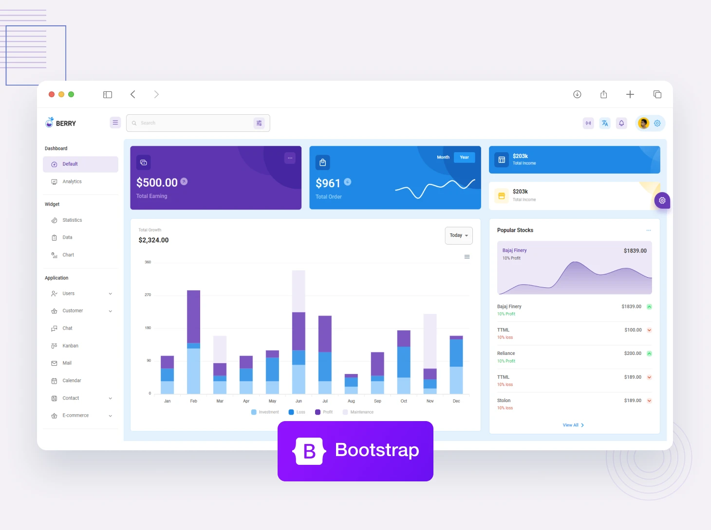
8. Design tokens, systems, and cross-platform consistency
What it is: Shared attributes (such as color, spacing, and typography) as well as component libraries that synchronize across various web, mobile, and product design applications.
Why it matters: It enables quicker iterations, results in fewer design discrepancies, and enhances syncing between product and engineering.
Small example: a single token instantly changes the primary button color across web and mobile applications.
9. Subtle 3D & AR (when it helps)
What these are: Use of lightweight 3D graphics or AR layers that are used sparingly to explain a product or show product scale. It isn’t gimmicky, it helps the user better understand the product.
Why they matter: Adds realism to complex items (furniture, gear) and increases conversion rate.
Small example: A shoe product page that has a 3D model of the shoe that the user can rotate.
10. Themes, dark mode, and system-aware UIs
What it is: UI that honours system theme preferences, provides multiple themes, and offers comfortable contrast.
Why it matters: Improves accessibility, power savings, and user comfort.
Small example: automatically switching to dark mode in the evening, and making the line-height more spacious for the reader.
Wrapping It Up
The best products in 2026 will be the ones that treat users as real people: with a mix of devices, abilities, and attention levels.
Whether it is AI-driven workflows, accessibility-first thinking, adaptive typography, micro-interactions that are subtle, or whatever else, all trends ask the same basic thing of you: to create interfaces that communicate clearly with the user, yet also care about the user’s comfort.
When you are conceptualizing for this year, use the trends as inspiration, not rules. Pair trends with strong design principles, with your users in mind and proven UX laws to guide your decisions. When in doubt, choose being clearer over being clever.
2026 is a great year to rethink how your product feels not only looks, and the more human your UI becomes, the more enjoyable the experience will be for users.
What UI trend impacts the most in 2026?
Long-term impacts will be experienced across the board thanks to performance and accessibility oriented changes.
Should small teams spend money on AI design tools?
Definitely. An immense amount of time can be saved during ideation and cleanup, but the actual creative concluding decisions, of course, will always be human.
Are micro interactions still a thing?
They are, but the key is to be subtle. It's best to use micro interactions to implicitly guide the user rather than to use distractions.
How do I balance personalization with privacy?
Providing clear controls, detailing what data is collected, and personalizing in a way that makes the experience better.
How can someone get started with UI and do it quickly?
Understanding UX laws is a good starting point. Then look at design systems used by large companies and practice with low-fidelity redesigns of basic screens.


Comments