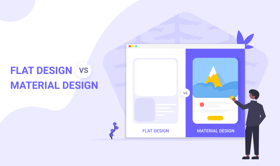
The new trend emerging every year, we have seen lots of flux in web Designing trend. With all this volatility, it is easy for Designers to get caught up in the latest craze which is Flat Design and Material Design. In this article, we will discuss the most trending Design concepts differences Flat Design vs. Material Design. We will find out the best User Interface Design and what is the difference between them.
Before we go into a discussion about both UI Design, Let’s get to know what is Material Design and Flat Design.
Flat Design
Flat Design is developed by Apple. It is a bare minimum Design and does not count 3D effects that can be graphics including the use of texture, shadow, and use of gradient. The primary focus upon color and typography.
In Flat Design overall appearance is not too important but it focuses on Design functionality.
Advantages of Flat Design
- Uncluttered, distraction-free Design
- High readability with clear typography
- Easily adjusted for responsive Design
- Faster to load in browsers and apps
Disadvantages of Flat Design
- Lack of depth makes elements looks less clickable
- Creative Design and standing out is harder
- No Design guidelines like other Design systems
Material Design
Material Design is developed by Google to use to create a mobile application for android. It provides interaction between the application and users. Material Design offers grid-based layout, animations, padding layouts and takes responsiveness into account. It is a highly flexible user interface in comparison to other Designs.
Advantages of Material Design
- Unified and simplistic interface
- Principles and goals provide consistency for Designers
- Z-axis creates depth
- Intuitive to use
- Uses motion to show users what is happening on screen
Disadvantages of Material Design
- Elements such as floating action buttons can be superfluous
- Designs only valid for Android devices
- Heavily associated with Google with less room for branding
- UIs Designed without motion often lack intuitiveness
Flat Design vs. Material Design
Flat Design and Material Design both are highly demandable in the market. Google released the Material Design for creating Android app Design whereas Flat Design released by apple without any official name. It focuses on clarity and depth as a result of which more vibrant colors are used.
Depth
When it comes to interaction with applications and devices, both Google and Apple have different opinions.
According to Apple mobile devices are seen as windows into another world, embracing infinite depth in their applications. Whereas, Google believes that humans should interact with the components as if they were stacked over each other. The users should feel as if they are holding the screen in the palm of their hand.
Animation, Pattern, and Shadow
Google considers animation as something that enhances the user experience and gives life to other components. Material Design uses different types of animations to express the type of Material to interact with. The animation would appear as if you are arranging cards on a piece of paper. If you want to refresh the Google page, it would bounce back. It is the key concept of Material Design.
On the contrary, Apple believes that animation should be in such a way that it takes the user to the destination without distracting the user from the actual content. Google tends to lean on the human side, while Apple tends to lean on the inorganic side.
Clarity
Clarity can be platform-specific and depends on what you are familiar with. Android users may not recognize the iOS icon instantly. Apple promotes gradients and blurred Design, while Google gives importance to drop shadows. Both the platforms replicate in real life in different ways. The center principle is simply to achieve perfect results.
Navigation
For a better user interface, navigation is a must-have element. This means organizing the structure of the app according to the tasks and contents that users like to see. Material Design offers fewer navigation rules and offers a higher level of flexibility for Designers. Google offers a number of components and an action button that easily reveal various options.
On the other hand, the navigation system of Apple is easy to use and understand. Their concept revolves around having an app that has less than five features and forces Designers to ponder over the functions of their app. Thus when it comes down to UI features, Apple and Google like to be different in their approach and preferences.
Responsiveness
Responsiveness is another must-have element of a great UI experience. Material Design offers high responsiveness. It easily goes inflow along with the user’s preferences and actions. This is similar to the real-world pattern.
Flat Design, on the contrary, lacks responsiveness. It is not similar to the real-world experience and offers black and white digital communication.
Conclusion
Design trend changes frequently, so if there are minor changes do not switch the Design system. If you really needed Designing system chooses between two of them according to your requirement.
Check More Articles –





Comments