Author:  React

Let’s be honest: you love shadcn/ui. The components are clean, you own the code, and nothing fights you. Then a client asks, “Can we add a pricing page?” and you’re building the same three column layout you’ve built five times before.

That’s the itch UIAble 1.0.0 scratches. It’s our first Pro release, so let me walk you through what’s in it and why it should save you real time.
Share this:

If you’ve ever stared at a blank screen trying to figure out how to build a “Subscription” alert dialog or a QR code scanner modal that actually looks good, UIAble 1.10.0 is going to save you a lot of coffee breaks. This release is all about giving developers more ready-to-use pieces for their shadcn/ui projects, so you spend less time reinventing common UI patterns and more time shipping features that matter.

Share this:

If you’re building with shadcn/ui, you already know the drill: the components are great, but assembling them into real, polished sections still takes time. That’s exactly the gap UIAble keeps closing, and version 1.8.0 pushes it further with new blocks and component variants.

Share this:

We’re excited to introduce SaasAble v2.1.0, our biggest update yet. This release brings powerful AI features, a new preview simulator, and a refreshed design experience.

Now you can create landing pages using simple chat prompts, instantly preview your ideas, and build faster with a smoother workflow.

Share this:

Building with a UI kit should speed up your development cycle, not slow it down.

SaasAble UI Kit comes with a rich set of production-ready React and MUI components, but turning an idea into a working feature still takes effort. Developers often spend time searching for the right components, writing custom logic, and constantly switching between their editor, browser, and documentation.

Share this:

We’re excited to release UIAble v1.4.0, bringing another set of open-source components and UI blocks designed to solve common interface patterns without adding unnecessary complexity.

Share this:

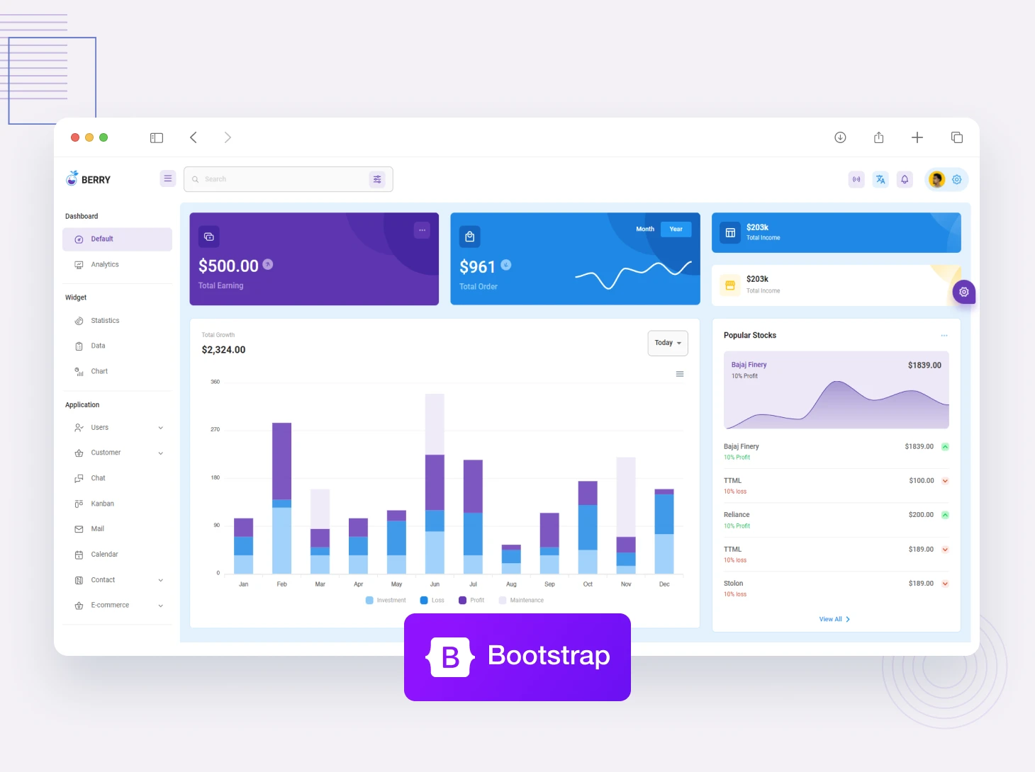
We’re excited to announce a major update to Berry Material React v5.2.0!

This update brings 3 new application modules, migration to MUI v9, improved dark mode, and better component consistency across the entire template. Whether you’re building SaaS products, CRM systems, or admin dashboards, v5.2.0 gives you a cleaner, more powerful foundation to build on.

Share this:

Today, we’re excited to launch UIAble v1.0.0, an open-source component library built for developers, by developers.

We explored a lot of UI libraries built on Shadcn. Most of them feel nearly identical — same structure, same aesthetic, same tradeoffs. That’s what pushed us to build something different. Not another library that looks like Shadcn with a coat of paint, but a design system with its own identity and a clearer sense of what it’s actually for.

Share this:

Animated UI component libraries are pre-built React component collections where scroll effects, hover animations, mount transitions, and micro-interactions come baked in by default. No more writing Framer Motion configs from scratch on every single project. In 2026, the good ones are shadcn-compatible, Tailwind-based, and ship source code directly into your project so you actually own what you use. This guide breaks down the top ten, puts them in a comparison table, covers how they work under the hood, and gives you a straight answer on which one fits landing pages, dashboards, and lightweight builds.

Share this:

Mantis React TS v4.2.0 is a major update which aims to make the template more stable and easier to use. We all know Frontend tools are always changing and it’s important to keep a project up to date not only for performance reasons but for a good development workflow.

This release includes a number of improvements to AI prompt pages, navigation, charts and UI consistency which leads to a cleaner overall experience for developers and end users.

Share this:
Popular Products
Categories
Popular Posts
The Ultimate Managed Hosting Platform