
Material-UI (MUI) is a highly popular React component library that accelerates the development of modern, responsive, and visually consistent applications. It offers a set of prebuilt UI components and icons that adhere to Google’s Material Design system. The system’s beauty lies in its ability to bring harmony to both functional and design aspects.
One might assume it to be difficult. But it is nothing of the sort. Installing the icons package, importing the icons, and inserting them straight into your components: this is how one uses Material UI icons in React. This easy route allows developers to bestow their applications with beautiful icons sans the cumbersome configuration.
Icons are quite important in React applications: they aid in usability by guiding users, enhance accessibility by providing strong visual cues, and improve visual design by establishing recognized patterns. The Materials UI icon set offers a vast variety of scalable and customizable icons that seamlessly integrate into your React project.
What Are Material UI Icons?
Material UI icons are a collection of prebuilt React components that showcase Google’s Material Design icon library. There are thousands, including icons such as navigation, media controls, actions, and social media, all ready for a modern user interface. These icons are scalable and accessible and may be styled like any React component.
The official package, `@mui/icons-material`, is built specifically for React and provides each Material Design icon as an SVG component. Thus, `@mui/icons-material` plies the SVG format and differs from several other icon packs (such as Font Awesome or Bootstrap Icons), most of which are font-based or rely on external CDNs. MUI icons, being SVGs, are extremely sharp in visuals, perform better, and provide easy customization through props like `color`, `fontSize`, or `sx`.
Why do developers like MUI Icons?
They:
- Follow Google’s Material Design standards to maintain design consistency across applications.
- Are SVGs; hence, they do not risk becoming pixelated when scaled.
- Has easy integration with MUI components such as `<Button>` or `<IconButton>`.
Essentially, MUI icons alleviate the burden on designers, enabling developers to focus more on their code.
How Do You Set Up Material UI Icons in a React Project?
Its use is very simple and straightforward. You just install the right package, import the icons you want, and use them directly inside your components. Let’s break each of the steps.
1. How to Install Material UI Icons in React?
Run the following command to install the core MUI package along with the icons:
# npm
npm install @mui/material @mui/icons-material @emotion/react @emotion/styled

# yarn
yarn add @mui/material @mui/icons-material @emotion/react @emotion/styled
This installs both the Material UI library and the icons package (`@mui/icons-material`).
2. How to Import Material UI Icons in React?
Import only those icons you need. Each icon is a React component:
import DeleteIcon from "@mui/icons-material/Delete";
import MenuIcon from "@mui/icons-material/Menu";
import SendIcon from "@mui/icons-material/Send";
Importing directly from `@mui/icons-material/IconName` keeps your project tree-shakable and lightweight.
3. How to Use Material UI Icons in React?
Drop icons inside buttons, toolbars, or anywhere inside your JSX expressions:
import React from "react";
import { Button, IconButton, Tooltip } from "@mui/material";
import DeleteIcon from "@mui/icons-material/Delete";
import SendIcon from "@mui/icons-material/Send";

export default function Demo() {
  return (
    <div style={ { padding: 20 } }>

      {/* Icon Button */}
      <Tooltip title="Delete">
        <IconButton aria-label="delete" color="error">
          <DeleteIcon />
        </IconButton>
      </Tooltip>

      {/* Button with icon */}
      <Button variant="contained" startIcon={<SendIcon />}>
        Send
      </Button>

    </div>
  );
}
This shows the two most common patterns:- Material UI Icon Button: wrapping inside `<IconButton>`.
- Button with startIcon/endIcon: text combined with icons.
Customizing MUI Icons
Icons are straightforward components within Material UI, which means there are various ways to style and customize them—an icon can be styled by its size or color, have hover effects, or even be affected by some global overrides.
Example 1: Direct Styling with Built-in Props for Size and Colour
MUI icons accept some built-in properties for colour and size:
import React from "react";
import { Stack } from "@mui/material";
import HomeIcon from "@mui/icons-material/Home";
import StarIcon from "@mui/icons-material/Star";

export default function IconCustomExample() {
  return (
  );
}
In the example above, `color=”primary”` means use the app theme colour. The `fontSize` option controls the size of icons, whereby it can be `small`, `medium`, and `large`, or others that can be customized in `sx`.
Example 2: Custom Styles Using `sx`
import FavoriteIcon from "@mui/icons-material/Favorite";

;
Adds a hover animation that scales the heart icon up and changes its colour.
Example 3: Global Style Overrides
Setting all icons to the same style can also be done using `createTheme` and theme overrides:
import { createTheme, ThemeProvider } from "@mui/material/styles";
import DeleteIcon from "@mui/icons-material/Delete";

const theme = createTheme({
  components: {
    MuiSvgIcon: {
      styleOverrides: {
        root: {
          fontSize: "2rem",
          color: "#1976d2",
        },
      },
    },
  },
});

export default function App() {
  return (

       {/* Automatically styled */}

  );
}
This means that every icon is inherited with the size and color defined in the global override.
Advanced Usage of Material UI Icons
Beyond the fundamentals, Material UI icons in React offer much more to improve performance, flexibility, and user experience in large-scale applications.
1. Lazy Loading Icons (Performance Boost)
Instead of loading all the icons at once, there is an opportunity to lazy-load some rarely used icons. This can reduce the initial bundle size, thereby speeding up the application’s load time.
2. Dynamic Imports (User-Driven Icons)
Based on user input or API data, icons can be dynamically imported. An example of setting this up would be: if the end user selects a theme or menu option, the corresponding icon can be loaded just-in-time.
3. Badges and Icons
Icons with badges are used to represent counts or notifications, such as displays for unread messages, warnings, and items in a shopping cart.
4. Reusable Wrappers for Icons
A reusable wrapper can be created for icons to avoid repeating the icon’s size, color, or style every time it is used. This fosters consistency throughout the entire app.
5. Theming for Dark/Light Mode
Icons can be styled to adjust automatically with the app’s theme, keeping them clear and accessible regardless of whether the user is in light or dark mode.
How Do You Improve Performance When Using Icons in React?
Suppose performance is something you’re seriously concerned about in Material UI icons in React. In that case, you’re aware that an app loading many icons on many screens can always be subject to greater loading times because of big bundles or unwanted imports. Here are proven methods to optimize performance:
1. Import Only What You Need
Icon imports must always be single imports importing to the whole library. This keeps the bundle small and treeshakable.
2. Use Lazy Loading for Rare Icons
If an icon shows up in an app section only sometimes, consider lazy loading. Lazy loading will fetch the icon on demand.
3. Optimize With Dynamic Imports
In configurable dashboards or apps with user-driven menus, you want to go for dynamic import of icons as opposed to upfront import.
4. Reusable Icon Components
Instead of repeating styles across icons, use a wrapper component. It brings maintenance cost down, reducing duplication for the final-rendering expenditures.
5. Use Theming
Tie icons to your global theme so that they adjust to user-preferred dark and light modes rather than writing multiple conditional styles around their use.
Real Life Examples of Material UI Icons
When applied in real-life projects, icons draw the greatest power. Just a few practical use cases where Material UI icons in React go far:
1. Dashboard UI
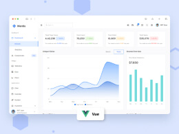
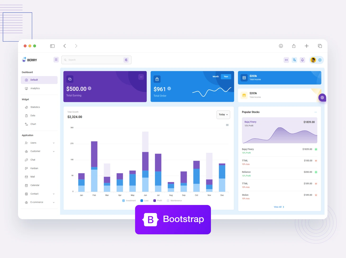
In any dashboard, icons represent navigation menus, settings, notifications, and quick actions. For instance, the sidebar may have icons: Home, Analytics, or Settings to provide the visual guidance for users. The icons enhance usability and take up less space than just text.
CodedThemes’ dashboards (Materially) already implement these approaches: you’ll find icons integrated into navigation, toolbars, and tables, so you don’t have to wire them manually.
2. E-Commerce Applications
Icons are needed in an app such as e-commerce for the shopping cart, wishlist, searching, and user account. They give instant recognition to the action and make user interaction speedy; for example, a cart icon with a badge can indicate the number of items in the cart, and a heart icon shows saved products.
CodedThemes e-commerce templates have these icon setups out of the box so that you may skip over those design decisions entirely and focus on business logic.
3. Mobile-Responsive App Design
On smaller screens, icons are used to keep the interface clean and uncluttered. In contrast to very long text labels, apps use icons for menus, navigation drawers, and bottom tab bars. Because Material UI icons are SVG-based, they scale perfectly on mobile, maintaining crisp visuals at all sizes.
CodedThemes templates also mind mobile responsiveness so that icons work seamlessly on desktop alarms or mobile-first applications.
What Are the Best Practices for Accessibility with MUI Icons?
Icons may look great; however, when accessibility matters, they cause confusion or exclusion for users. When employing Material UI icons in React, you must abide by those best practices that render your app usable by everyone, including those who rely on screen readers.
- Always add labels: For interactive icons (e.g., delete, menu), assign an aria-label or simply wrap the icon in a button containing accessible text. This will assist a screen reader to read the action clearly.
- Use tooltips for clarity: Using tooltips with your icons will enable the user to know exactly what an icon represents immediately. This is especially useful for when you are using an icon and no text.
- Use icons as a supplement, and not a replacement: When possible, always combine an icon with a short text label. Only using icons can be a source of confusion for users that may not know what the icon represents.
- Maintain contrast: Your icons should stay consistent with your theme and the contrast rules of your theme in both light and dark modes. Low-contrast icons are difficult or impossible for many users to distinguish from the background.
- Use standard symbols: Use Material Design for its recognizable and reliable icon set. A trash bin for delete or a magnifying glass for search provides the user with much less cognitive load and confusion.
Accessibility patterns (aria-labels, tooltips for icons) currently exist in CodedThemes templates in Materially. By using the templates, you can build accessible dashboards, e-commerce applications, or admin dashboards without adjustment.
Conclusion
In React, it’s simple to use Material UI icons to help you create clean, accessible applications and maintain visual consistency throughout your application. Icons provide usability, guide users, and enhance design from simple buttons to complex dashboards. We have reviewed how to install, import, customize, and optimize icons to improve performance, as well as how to adhere to best practices for accessibility. Alternatively, if you are looking to skip setup, you can find numerous available templates in Materially from CodedThemes, which include icons out-of-the-box for dashboards, e-commerce, and responsive applications. Therefore, you can concentrate on building features while retaining a professional, user-friendly UI.
FAQs
How do I install Material UI icons in React?
You can install Material UI icons by typing:
npm install @mui/icons-material @mui/material @emotion/react @emotion/styled
This will give you access to all the Material Design icons as React components.
Can I use Material UI icons without Material UI?
Yes, you can use Material UI icons without Material UI. While they're most compatible with MUI components, you can also import and use `@mui/icons-material` as standalone SVG icon components in any React project.
How do I customize Material UI icons?
You can customize Material UI icons by changing their size, colour and hover behaviour using standard props such as `color` and `fontSize` props, or through the `sx` styling prop for full customisation.
Are Material UI icons accessible?
Yes, but are you adding your `aria-label`s, tooltips and making sure there is sufficient color contrast, so users, including screen readers, realize what the purpose of the icons are?
How do I optimize performance when using many icons?
You can optimize by only importing the icons you need, lazy-loading icons that may rarely be used, and reusing wrapped styles (wrappers). Product component templates, such as CodedThemes Berry and Mantis, already include optimizations.


Comments