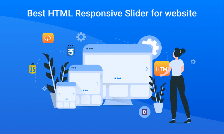

HTML Responsive Slider is one of the most controversial for web design; some designers love it, some hate this. The same goes for web developers; some developers cannot imagine a website without them, whereas some are never used to it.
One of the reasons for the different views because sliders are great instruments for displaying lots of information within a small space, at the same time, they can be SEO-killers, user experience blunders, and destroyers of marketing strategies. Therefore, with such strong arguments for and against, using sliders in web design is always a case of personal preferences.
In this article, we will discuss the best HTML 5 slider. We’ll see responsive text sliders, responsive image sliders with text, banner sliders, and more. All built with HTML5 and CSS.
Why use a responsive HTML5 slider?
HTML 5 enables users to have a better and more consistent web experience across several devices. Nowadays, smart devices are most frequently used by people, so your site must be responsive. It needs to work on varying screen sizes and resolutions.
A professional, responsive HTML5 and CSS slider will look great and work great on all these devices. If you have image-rich content or want to present key text in an interesting way on your website, then you just can’t go wrong by using an HTML Responsive Slider.
Pros of using an HTML Responsive Slider in web design
- Highlighted particular areas.
- Reinforce the impact of the overall design and experience.
- Provide helpful visual material for the content.
- Demonstrate not one but two or three new additions or popular offers.
- Draw the user’s attention and focus it on one section.
- Display text snippets elegantly and unobtrusively.
- Enrich content with information right inside the reading flow.
- Create a promotional landing page.
- Power modern storytelling experiences, especially those that need to cover lots of information.
Cons of using a HTML Responsive Slider in web design
- The poorly-made slider is considered bad by search engines. It can ruin your SEO scores.
- The slider may slow down the website. Not only does it negatively influence user experience.
- Too many options may confuse customers and make them even more indecisive.
- The slider may work incorrectly on small screens due to poor optimization. This can scare away the mobile audience that is prevailing these days.
- In a small screen, content in the slider may be challenging to interact with. Therefore, the carousel requires special styles and behavior for mobile telephones and tablets.
- Some people consider sliders as advertisement banners, ignoring them completely.
- If the browser does not support JavaScript or some modern CSS features, then the slider may break the entire design and structure.
- The majority of website sliders do not meet accessibility requirements making them blind spots for disabled people.
The Best HTML Responsive Slider 2020
There are so many sliders to choose from that I have listed the best HTML Responsive Slider for images and text.
Ultimate 3D Carousel

Ultimate 3D Carousel is a fully 3D multimedia carousel slider plugin that allows displaying multimedia content with a unique original layout from a 3D perspective. It’s perfect for any kind of presentation. It runs on all major browsers and mobile devices like iPhone, iPad, IOS, Android, and Windows. When a thumbnail is clicked you can choose to do nothing, display multimedia content using our great revolution lightbox.
There are a number of effects you can apply to your carousel-style if you choose, and if you prefer a more traditional slide effect, you can also opt for that instead of the carousel style.
Ultimate 3D Carousel has high performance using OOP code and the latest CSS techniques, ready for mobile with swipe, very flexible, easy to set up, and extremely customizable.
Simple 3D Coverflow

Simple 3D Coverflow is a fully 3D multimedia coverflow slider that allows displaying multimedia content with a unique original layout from a 3D perspective using different 3D topologies with great attention to detail. It’s perfect for any kind of presentation, for anyone that wants to deliver a great visual impact to their visitors.
Some of the best features are:
- Responsive image slider with text that looks great on mobiles as well as desktops
- Navigation support for mouse wheel and the left/right arrow keys on the keyboard
- Ability to classify thumbnails into categories in a slideshow
- Two skins, with nine different layouts for each of them
Creative BS-4 Carousel Slider

Creative BS-4 Carousel Slider comes with different animation effects and touches swipe. You can use it on your website or anywhere in your project. The framework already provides a lot of features and capabilities. It makes sense to take advantage of this fact and create a multi-functional slider.
The slider included 33 different carousels which are integrated with any website. It is completely customizable and ready to use. This plugin can create carousels for everything from products to testimonials and portfolios to video carousels.
Vertical 3D carousel

Vertical 3D carousel offers a unique solution when it comes to sliders and carousels. It’s perfect for any kind of presentation, for anyone that wants to deliver a great impact to their visitors.
It has implemented drag-and-swipe-based navigation for desktop and mobile devices. Vertical 3D Carousel also lets you navigate through all the slides using a mouse wheel or with the left and right keyboard keys.
It offers a bunch of parameters to control the alignment and separation of different slides in both horizontal and vertical directions. There are three different skins, each of which can be used with three unique layouts to create a slider.
CSS3 Cube Slider

Cube Slider uses CSS3 transform property for creating 3d cubes elements and animating them in a cube slider.
The plugin works well with every device and browser, then the slider falls back to the standard vertical or horizontal slide transition.
Due to CSS3 still to complete as standard this plugin in css3 mode is best on Chrome and Safari, meanwhile works well in Firefox with some small screen bugs.
Simple image slider carousel

simple image slider carousel comes with lots of awesome layouts that showcase all your images. It is easy to integrate. It can display any number of images in a slider/carousel style with extreme fine-tune control.
You can create the image playlist using either HTML markup or JSON data. There are a lot of other features such as navigation based on swipe gestures and keyboard arrow keys.
It has high performance using OOP code and the latest CSS3 / HTML / JS techniques, ready for mobile and desktop, very flexible, easy to set up, and extremely customizable.
HTML5 Canvas Carousel

HTML5 Canvas Carousel is a great option to display images. This 3D photo gallery offers six different options for presenting your images.
This HTML5 Canvas Carousel can have any image presented in any way you want: horizontal, vertical, oblique, also it has unique presets with pre-defined movements and presentations.
This responsive HTML5 carousel is highly customizable, and all options can be modified inside the XML file.
Features include touch-screen navigation support for mobile, support for PNG, JPEG, and GIF image files, the ability to set the carousel position, and the possibility of featuring multiple carousels on the same page of your website.
Ultimate Media Gallery

Ultimate Media Gallery is a responsive and highly customizable jQuery gallery plugin. It can display images as well as audio, video from a number of external sources such as YouTube, google drive, etc.
The media gallery is fully responsive and mobile-friendly. It takes full advantage of Font Awesome Library icons, and all demo examples are included in the download package for quick and easy setup.
Shopping HTML5 Banners with Interactive Slider

These HTML5 banner sliders are meant to be used for creating HTML5 banner ad templates for AdWords, DoubleClick Studio, AdRoll and other ad platforms.
It is created with and fully editable in Google Web Designer. You can also change the colors and background with just a few clicks.
This is the perfect plugin for people who want to create interactive ad banners to sell different products.
How to use slider on your website
1) Use Sliders to Showcase Important Products and Services
Sliders occupy a large portion of your screen. This makes them ideal for pitching your best product or service. Also, make sure that you avoid clutter. Each slide in the carousel should focus on just one aspect of the product and do it well.
2) Include Call to Action Buttons
It is important to include a direct call to action button somewhere on the carousel itself. If a visitor likes one of your products, they should not have to go somewhere else to make the purchase
For more articles: Click Here


Comments